.png)
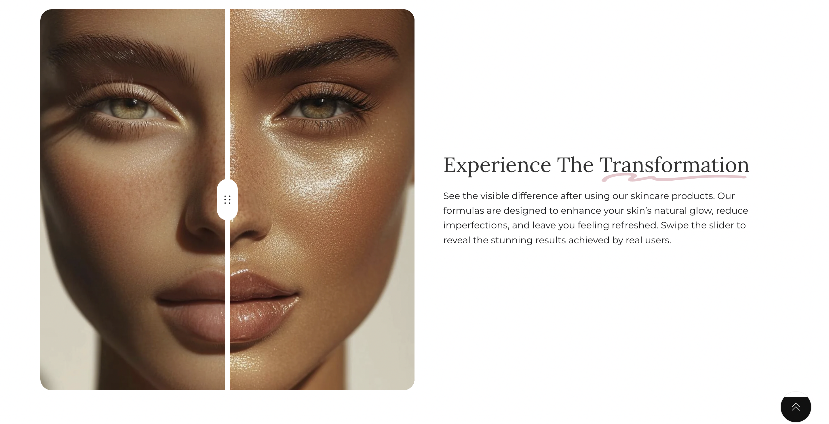
Image comparison
Showcase side-by-side image comparisons to highlight product transformations, before-and-after effects, or visual differences. Customize image placement, size, and overlay opacity for desktop and mobile. Add supporting text, headings, and call-to-action buttons to enhance engagement. Options for parallax effects, custom colors, and layout adjustments provide flexibility in design.
How to add image comparison section
.svg)
- Access the Theme Editor: Navigate to `
Online Store > Themes > Customize`. - Add a Section: Click on `
Add section`and select the desired section from the list of available sections. - Customize Your Section: Adjust the settings such as display type, alignment, and visibility according to your preferences.
If you need a more detailed, step-by-step guide on accessing the theme editor, adding sections and blocks, refer to our Setting up theme sections and blocks article.
General section settings
Within this section, you'll find common settings like containers, visibility options, and color settings that are consistent across all sections. For more detailed information on these shared settings, please refer to the Common settings between all sections article.
Unlike the other sections that contain a section header, this particular section does not include one. Instead, the content is presented as blocks that overlay the image within the section.
Section Settings:
- First & Second Image - Upload two images for comparison.
- Image Height (Desktop & Mobile) - Choose from predefined sizes or set a custom height.
- Custom Image Height - Manually define height for desktop (300px - 1000px) and mobile (300px - 600px).
- Overlay Opacity - Adjust the transparency of an optional overlay (0% - 100%).
- Parallax Effect - Enable or disable a parallax scrolling effect for the images.
- Image Position - Set the position of images (left or right on desktop, above or below on mobile).
- Image Width (Desktop) - Choose a small, medium, or large width for images.
- Content Position on Desktop - Define alignment of the text content within the section.
- Subheadings & Headings - Add subheadings and headings for each image.
- Text Alignment - Adjust text alignment for both desktop and mobile.
- Button Settings - Customize the button label, link, and alignment.
- Color Scheme & Background Color - Set a predefined color scheme or a custom background color.
Block Settings:
- Subheading: Add a subheading with adjustable size (small, medium, large).
- Heading: Add up to three headings with customizable text and size (small, medium, large, extra-large).
- Text: Provide rich text content, with the option to enlarge it for emphasis.
- Buttons: Add up to two customizable buttons (primary or outline styles).
- Icon with Text: Choose an icon from the preset library or upload a custom image. Customize the icon size and provide supporting text.
- Icon: Select an icon from a predefined list or upload a custom icon to enhance the section design.
- Collapsible Tab: Create collapsible content blocks with an optional icon, rich text, or dynamic content from a selected page.
- Spacing: Adjust the vertical spacing for desktop and mobile (0-50px).
Custom Code: Add custom HTML or Liquid code blocks if needed.
